As branding specialists, we’re taught that a little bit of white space can really balance out our visuals. According to the brand designers’ 101, leaving gaps in between logos, illustrations, and snippets of text on any kind of graphic can help to:
- Create balance within a design
- Emphasise certain parts of the design
- Draw the eye to the most important element
- Improve the overall readability of the piece
And while we don’t disagree with any of these points, we do often wonder, has the trend for design minimalism led many brands to underutilise their marketing assets?
More specifically: are designers making the most of the space that’s available on their packaging to not only make sure they’re getting their message across, but also create a strong sense of branding that ensures their items are immediately recognisable?
For many years, less has been more. But we think that, when it comes to designing up your branded boxes, bags, printed tissue paper and other merchandise, more might be necessary – especially now that the retail market is so saturated, and there are so many other businesses vying for your customers’ attention.
You need to be coming up with designs that are bold, eye-catching, and impossible to ignore. Can you really achieve this with a simple logo placement and a couple of lines of text?
It’s time to start filling in the gaps
A lot of higher end brands and more eco-conscious ventures like to keep their designs low-key, either to give off the impression of exclusivity or to use less resources within the manufacturing process. But by doing so, they could be missing out on opportunities to engage with their buyers further.
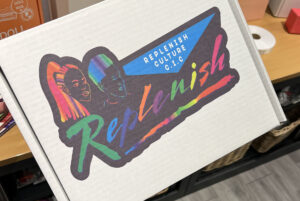
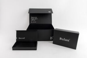
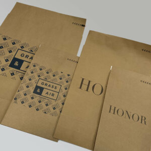
Let’s use our custom printed boxes as an example. These cheap yet impactful products provide companies with a lot of space to work with; a lot of ‘real estate’ to use when it comes to visually communicating with their customers. There is plenty of room on these items for a large, hi-res logo, a neat graphic and a short, to-the-point strapline. It’s what you do with the rest of the space that makes all the difference.
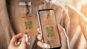
Many companies, like Amazon, are using their branded packaging to push their AR strategy. They are kitting out their printed mailing boxes with QR codes that, when scanned, take the customer to an app that allows them to interact with the illustrations on the packaging by applying lots of fun filters and special effects directly to the graphics. This is a brilliant way to encourage people to hold onto their boxes for longer – and an exceptional means of keeping them engaged in the brand well after they have got their hands on their new purchase! Others, like McDonalds, are champions of turning otherwise bland boxes into colouring books and buildable cardboard toys.
Similarly, socially responsible businesses are adding mentions of their latest campaigns and charity partnerships to their packaging to champion their favourite causes and share their brand values.
So you see, while it can be tempting to stay firmly on the minimalist wagon, there’s a lot to be said for using your packaging space in more creative and unusual ways. There’s a place for blank space in every design – but by packing more interest into your packaging, you can make sure these functional tools are having an even stronger impact on your customers and encouraging them to dive even deeper into everything your brand stands for!
If you need help coming up with packaging design ideas, the team here at Hallmark Labels will be happy to talk you through your options. And remember, we also offer artwork design services for those of you who don’t have design expertise in-house.